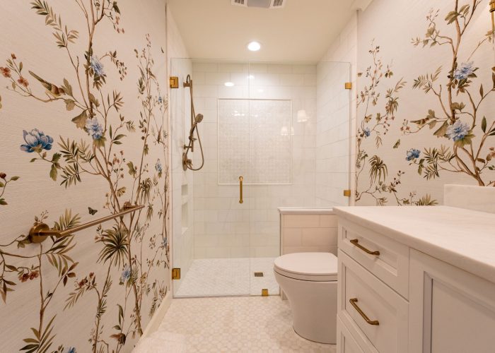
Coloring never goes out of style, even when you move from paper to drywall and turn in the crayons for a paint brush and roller. Color evokes emotion as well as perceived space. Active colors like red, orange and yellow offer both warmth and excitement, like sunshine and fire. Green and blue are passive with the peacefulness experienced in landscapes, parks and water.
Browns, creams and grays are neutral. The revered Pantone Color of the Year for 2025 is Mocha Mousse, described as the evocative, sensual brown found in coffee and chocolate. That stimulates some warm and fuzzy feelings, for sure.
The Austin flag utilizes six colors – two shades of blue, two shades of yellow, red and white. Every color under the sun appears in the 84 creative murals painted all over the city. One of the city’s nicknames, “City of the Violet Crown”, is attributed to the violet glow of light across the Texas hills at sunset. That moniker is shared with Athens, Greece, another city known world-wide for its colorful vibes and dynamic art, culture and food scenes.
With all the colors represented in the region outside, one can’t go wrong with any color on the inside. Family homes, like those in Cedar Park, Rollingwood and West Lake Hills, often sport light shades of neutral colors in the large open spaces, deep colors in powder rooms and small nooks, and bright, bold shades of everything in teen’s and children’s bedrooms and play spaces.
There are many more colors of paint than carpet and furnishings, so it makes sense to choose paint after deciding on furniture. Paint is less expensive and can be changed in a medium size room for a couple hundred dollars. One paint tip that often works well is to choose a color two shades lighter than the one you fall in love with.
- 60% ~ wall space for one dominant color
- 30% ~ furniture, accent wall, complementary color
- 10% ~ decorative art, wall décor, linens
This rule is bending frequently now with the popularity of accent walls, faux finishes for texture and interior ceilings with color. A ceiling represents approximately one-sixth of the space in a room, and it has almost universally been painted white with specially-formulated white ceiling paint. Porch ceilings have been light and medium blue for ages, and the blue, along with other colors, is finally coming indoors. Light colors make ceilings feel higher, and dark colors give the perception of lower, which produces a more cozy atmosphere.
Wallpaper is coming into vogue on ceilings. Something elegant can be found in the formal dining room, and whimsical looks go into nurseries and kids’ spaces, like clouds, stars and nature scenes. Overhead is the perfect place to add paint color, too.
Dark colors make a room feel smaller, while light ones project more space. Bedrooms and bathrooms are often in the blue, green and aqua spectrum for soft, quiet advantages. Energy in the bold and bright red shades going into oranges and purples, like our Texas sunsets, work well in family rooms, play rooms and activity-based spaces. Bright red stimulates moods like no other color and has been reported to raise blood pressure and heart rate, but this primary color can promote energy and a sense of wellness.
Yellow connotes happiness and sunshine, so it’s popular in kitchens, dining rooms and hallways. In small rooms, yellow can give the perception of being more airy and spacious than its dimensions. There have been studies, however, which document that babies cry more in a yellow room, and people are more likely to lose their temper. Apparently, too much yellow or too bright a shade is frustrating. Blue is considered a quiet, tranquil color, lowering blood pressure and breathing rate. Light blue can be chilly but warms up with furniture and decorative accents. Dark blue reportedly evokes sadness.
Purple is dramatic and luxurious, and lighter shades warm a bedroom. Orange is energetic and fits any season. A medium, light shade can mimic flowers in spring, orange sherbet in summer and pumpkin and harvest warmth in fall and winter. Green is the most restful color, a blend of the qualities of blue and cheerful attributes of yellow. It is also the most predominant color in the world for its presence in nature.
Neutral colors abound and are useful anywhere. Bold color accents can be added in window treatments, pillows, throws, artwork and collections or one wall or behind shelves. If you are so moved, you could display your love for Texas by painting one large sole star on a navy blue wall. Find more tips and tricks on our monthly Habitat Hunters blog!